Showing posts with label Art Lessons. Show all posts

Friday, February 19, 2010

Joan of Art Painting Lessons


For starters, I recommend to use acrylics, because it's water-based, thus safe to use for children.

1. Easel - I prefer my students standing while painting to allow more freedom of movement and in order for them to step back once in a wile to see their painting from a distance.

2. Apron or working clothes - expect paint splatters all over your clothes and skin so better protect them with an apron or better, wear old clothes while at work.

3. Canvas - buy by the meter at this telahan at the atrium beside centroplex in central market (I forgot the name! daw ong pio, I think?)

4. Canvas stretcher - your choice between two types:

a. Plywood stretcher - get the thinnest plywood you can get, ang pwede mautod sang cutter, no need lagare. It costs about P220 the whole 8ft x 4 ft, that should give you a lot of standard 18"x24" cuts (please do the math na lang kun pila). Then cut some of the 18"x24" into four 9"x12" cuts for the smaller works, or half lang at 12"x18". Now you have at least three sizes to work on. However, you must have to frame this after your artwork is done.

b. Bastidor - for smaller 9"x12" or even 18"x24" works you can use the 1"x1" and 1"x2" for the bigger ones. Kay natak-an na ko ya magpalopez-jaena to buy the gemelina lumber, sa citi hardware na ako gapamakal kahoy para nasapiyo na. But I heard other artists have their bastidor frames made at lopez-jaena at a reasonable price, without the canvas pa. The advantage of working on the bastidor is that you don't have to frame it unless you really want to, and the "bounce" of a backingless canvass is more preferred by artists than the hard press of the plywood-backed canvas.

*Note - How to stretch your canvas: it is best to staple your canvas with a gun tacker starting from the center on one side, then the center of the opposite side, then from the center of the other side, then its opposite side, working on to the corners, as shown in this illustration. If you have time, please observe how the other canvas are neatly and tightly stretched in place. Soon you will be able to get the hang of it and even develop your own stretching technique.

*Note - How to prime your canvas: in lieu of acrylic gesso which is not available in the local market, we use white DAVIES acrylic semi-gloss, as advised by our mentor for a more vibrant underpainting. We are taught to put value to our painting so that even the things that are not seen in painting have to be already good in order to give your artwork a good foundation and the luster that other paintings don't seem to have. Paint your canvas with three layers of paint but you may add more up to five coats for a better primed canvas support. Let dry. Now you are ready to use your primed canvases for your painting.

*Note - another excellent painting support is lawanit or hardboard, which is very acceptable and even better than canvas because of its more rigid surface. In fact, many of the old paintings that survived have been painted on wood panels. You have the option to paint on either side of the lawanit. Although I prefer the rough side for texture, you can also choose to paint on the smooth side, just sand it before coating it with gesso or acrylic primer and in between layers.

5. Brushes - for starters, choose cheap nylon brushes (the red sable ones) available at national bookstore. There are rounds, flats, and other types of brushes. Choose several types of various sizes. The more you paint the more you will discover a particular liking to a certain brush type/size.

6. paints - for starters, choose mid-range acrylic brands such as Reeves, Liquitex, and Grumbacher which is the ones easily available in the local market. If you buy cheap paint, you might regret it because their pigment quality are not as vibrant. Always put value to your painting so it is better to start with mid-range quality paints and move up to the more expensive ones when you have mustered more and more confidence. There are two kinds of paints, the artist grade and the student grade. The latter has less pigment because it contains more extenders. The former is of course more expensive because of its more concentrated pigments. It's your choice then which to buy. You may also buy by boxes of 12, 16 or 24 colors, but always buy an extra tube of white color. you'll be surprised at how much you will be needing a lot of white in your painting. It is better though, to buy the big individual tubes as long as you have all of these colors:

a. red
b. yellow
c. blue
c. yellow ochre
d. burnt sienna (dark brown)
e. white x 2 or 3

You may or may not buy a tube of basic green. Note: some would advise to buy only latex paint by the can, which is the cheapest acrylic paint. That may also be an option but it is not a good idea if you want to preserve your painting for a long time. But it would be fun to spill latex paint all over just for the heck of it. you can try the new elastomeric acrylics by sun and rain because it has a built in primer unlike the old latex tinting colors which has to have white as binder in order for it to stay. Primary colors red, yellow, blue, and white and also black will do.

For your tube paints, don't buy black. Real artists never use ready-made black. We will learn how to mix our own, more dramatic black.

7. Palette - cheap plastic ones at national bookstore will do. Or any old glass plate will also serve the purpose.

8. Water mister - the kind you spray your orchids, no fertilizers, of course. This will help delay the drying of acrylics because unlike oil, acrylics dry fast. Because we don't have retarders (chemical solution that is added to acrylics to delay drying time), we use water to extend the wetness of acrylics.

9. Old cloth - to wipe away paint splatters and mistakes.

10. Old newspapers - to protect the floor.

11. Sketch pad - for sketching your studies.

12. Mongol 2 pencil - for sketcing. no erasers, no rulers. we do freehand drawing. the more mistakes, the more learning!

13. Original photographs - for originality and copyright concerns.

14. Water containers - for washing your brushes (old mugs or clean gatorade bottles will do)

15. Mineral water jug caps - or gatorade bottlecaps or similar containers for smaller dips to control water splashes (and to conserve mineral water which we will use in the actual painting).

16. Old wine bottles - for still life arrangements

17. Round fruit - for still life arrangements (because they have simpler shapes than a bunch of bananas or a pineapple, unless you are ready for the challenge)

*module - my art lessons are based on God's creation, therefore...

The First Day
Night and day - a study of light and shadows. 1 session.

The Second Day
The separation of the waters - a study of seascapes and cloudscapes. 1 session.

The Third Day

The first appearance of dry ground - a study of landscapes, trees, flowers. 2 sessions.

The Fourth Day
With the sky now clear, the sun, moon and stars were dependably visible. 1 session.

The Fifth Day
Great numbers of birds and sea creatures - a study of birds and fishes. 2 sessions.

The Sixth Day
Vast numbers of land animals. Man - a study of animals, man (face and whole body). 3 sessions. Total: 10 sessions.

The Seventh Day

God rested from all the work of creating that He had done - exhibition (optional).

Fee: P100/pax if more than two students, P150/pax if one or two students only. On a per session basis, because you can never really count the hours when you're painting.

Sunday, November 29, 2009

Oil Pastel Painting One-on-One Lesson

Pablo Picasso once said, "All children are artists. The problem is how to remain an artist once he grows up."


When confronted by a blank sheet, children are not afraid of it the way adults are. They just attack it and in a matter of seconds, it's painted all over with a beautiful work of art that's free and unrestrained.


Children need only familiarize themselves with the medium they are working and then let them be. This is our aim with our 12-year-old art student. At least, before she fully grows up and develop that dreaded fear of the blank sheet, we will try to capture that precious childlike essence that will never happen again in a person's life.


Already gifted with a talent for art, June Anne tries her hand on first oil pastels in a one-on-one lesson with yours truly. After an hour or so, voila, her very own artwork of a prairie house.

Tuesday, November 17, 2009

You Can Never Go Wrong in Oil Pastel Painting


You can never go wrong in oil pastel painting. That's one thing I like about it. The other thing is that an oil pastel box is so handy that you can carry them just about anywhere and start painting.

Because an oil pastel works best in toothed surfaces such as oil pastel paper, handmade paper, watercolor paper, sandpaper, and other textured surfaces, practically you can never go wrong in oil pastel painting. Like oil and acrylic painting, you can always paint over your mistakes. So that your support ( oil pastel paper, handmade paper, watercolor paper, sandpaper, etc.) would not go to waste.

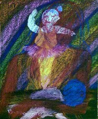
Take for this experimental oil pastel piece in ghastly colors. Not only did I not like it, I also didn't want to see it ever again. So I have to paint over it, and support is never wasted.


First, I did my sketch over the unwanted artwork using a stick of oil pastel. For my oil pastel sketches, I would usually pick the longest sticks which means these are the colors I rarely use because they are still more or less intact.


Next, I color in my underpainting, still using the colors I rarely use so that these oil pastel sticks would have to have some use. I also pick colors that are still largely available for my background. I would like all my oil pastel sticks to be used up at about the same level.


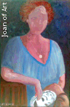
Finally, I work on the details, shadows and highlights. Voila! My mother and child (actually a self portrait) oil pastel painting.

I think I have found my calling: doing body portraits as opposed to realistic face portraits.

Not only is there no waste in supports when doing oil pastel painting, the oil pastel sticks can be used up even up to the last bit. Thus, worry not, for you can never go wrong in oil pastel painting.

Thursday, October 29, 2009

Oil Pastel Painting Step by Step Process

Here is a step by step demonstration of how I do my oil pastels.

Support (paper, board, canvas, etc.) is very important in painting in oil pastel. It must have a "tooth" so that the colors stick well to it. By preference, I use black #120 sandpaper. I also use watercolor paper, especially my failed watercolors so that I could still make use of the textured paper which is quite expensive to just throw away. Since sandpapers come in standard 9"x11" cuts or by meters but still 11" in width, I also make my own homemade sandpaper.

Although I have a high regard for the discipline, patience, and so much time spent on it, realism or photorealism is just not my style. I don't use a pantograph to copy the exact proportions of a face or body.

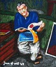
My favorite subjects are everyday people in their usual habits. That way, the pose is more relaxed and not self-conscious. I tend to leave the faces blank because my audience can already tell who my subject is just by the shape of their bodies. Adding facial features that may turn out wrong will only ruin the fun of the guessing game.


My procedure is to paint from dark to light, background first, although there are instances when this is not the case.

First, I sketch on sandpaper using a color I would use for the background so that it would blend later on when I color. Sometimes, I would also choose a pastel stick I rarely use like orange, pink, or apple green so that they will serve their purpose. Then I color in the colors, starting with the midtones.


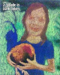
Second, I color in the darker colors or darker tones. That way, shadowy areas in the painting gets "thrown back" into the painting such as the eye sockets, the mouth, and the deep forest behind the subject.


Third, I shade in the darkest tones to really throw deeper into the painting the shadowy areas. In the meantime, the work in progress has a spooky look. Some artists I know would rather go for the gothic look. But no matter how I try to paint weird, despite my angst, my "wild" paintings often come out lame, so I guess that's just not my style, and a realization that I still am a happy spirit after all.


Fourth, I shade in the light tones using hatching, feathering, and glazing strokes.


Fifth, I put highlights to lift areas that should be contoured. Doing highlights on the face is just like putting makeup -- shadows, blush, and highlight. In my smaller figures I really leave the faces blank but since this piece has a larger subject, I am compelled to add just a hint of details on the face. However, I think I put too much highlight on the upper lip so that the mouth looks like pouting out when it should not. Then I decided to work the eyes a little bit but they turned out to be a disaster because the caucasian eyes became chinky with just a few flicks of color. Since I use the blunt end of the pastels as well as the sides thus coming up with rough, loose effects, just a teeny-weeny stroke could alter the look of the subject. Notice that I already signed my name on the artwork but it doesn't mean that I'm done with it as I still have something to give to it. And I need not worry because pastels, like oils and acrylics, are easy to correct -- you just have to paint over the areas that need correction.


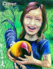
Sixth, I incorporated my corrections such as the mouth by lessening the highlight on the upper lip and widening the smile by smudging in more black. I added more strands to thicken the hair and I also added more blue on the shirt sleeve and more skin tone to make the arm a little less skinnier.


Exhausted after three hours of working on this particular piece, I felt I was already spent. I cannot give anything more to it, and so it is truly finished.

I call this painting "Talisayon Talisaynon" because the breed of game fowl is Talisayon and the girl holding it is a tru-blu Talisaynon (a native of Talisay City, Negros Occidental, Philippines) whose heart she declares will always belong in her native country inspite of her new home in Manchester, England.

Wednesday, October 21, 2009

How Do You Know When a Painting is Finished?


Jackson Pollock the famous abstract expressionist, in response to the question, "How do you know when you're finished?" replied, "How do you know when you're finished making love?"

I would ask the same question (excluding Pollock's reply) to my art students. There are actually no right or wrong in their answers, but I believe that, a painting is finished when the artist has nothing more to give.

Just as the artist gives of his or her self to the work in progress, it is finished when the artist has nothing more to give to it.

And so, one of my art student, sick and tired of completing his work, then declared, "I have nothing more to give!!!"

When the artist has decided that the work is finished, I always my student to make it a habit to sign his artwork, even if it is just a hastily done study. As children have the tendency to write their signatures at the very edge of their work, I would ask them to indent them about a pencil's or finger's width from the edge.

The Greek artists used the expression "tetelestai" (te-tel-es-sty), an everyday language which means "it is finished". The artist would stand back at a finished painting or sculpture and say, tetelestai – it is finished, there is nothing more that can be done to make this piece of art any better. The work is complete. It was also one of Jesus' last words on the cross.

Signing the work is like putting a period at the end of the sentence, a mark that it is finished. A date or year next to the signature would easily indicate when the work was done. The signature should be legible and must distinguish the artist rather than confuse the audience. It should not be so elaborate as to be taking much attention off the main artwork. It is best to use the leftover paint used in the painting so that the colors would easily blend in the painting and would not look like an afterthought.

Related Posts with Thumbnails

Discover